
Introduction#
redo the css crash course and chapter 15 layout of html book, see demo here
HTML#
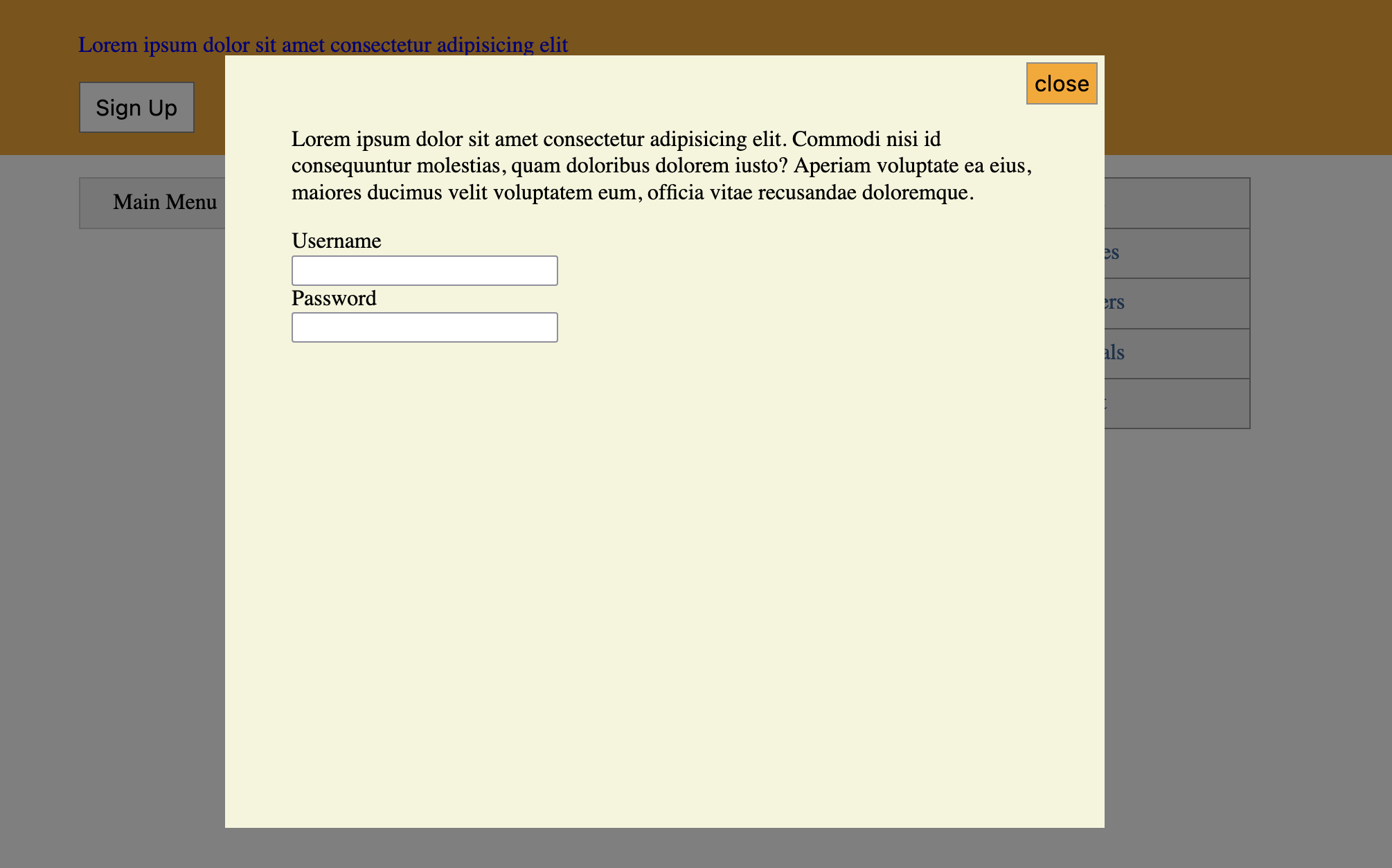
the html page with modal and menu
<body><header class="top-banner"><div class="top-banner-inner"><p>Lorem ipsum dolor sit amet consectetur adipisicing elit</p><button id="open">Sign Up</button></div></header><div class="modal" id="modal"><div class="modal-backdrop"></div><div class="modal-body"><button class="modal-close" id="close">close</button><h2></h2><p>Lorem ipsum dolor sit amet consectetur adipisicing elit</p><form><label for="username">Username</label><input type="text" id="username" style="display: block;" /><label for="password">Password</label><input type="text" id="passowrd" style="display: block;" /></form></div></div><div class="container"><div class="col-main"><nav><div class="dropdown"><div class="dropdown-label">Main Menu</div><div class="dropdown-menu"><ul class="submenu"><li><a href="#">Home</a></li><li><a href="#">Coffees</a></li><li><a href="#">Brewers</a></li><li><a href="#">Specials</a></li><li><a href="#">About</a></li></ul></div></div></nav></div><aside class="col-aside"><div class="affix"><ul class="submenu"><li><a href="#">Home</a></li><li><a href="#">Coffees</a></li><li><a href="#">Brewers</a></li><li><a href="#">Specials</a></li><li><a href="#">About</a></li></ul></div></aside></div></body>
Modal#
Use fixed position to create overlay modal back-drop and modal
.modal {display: none;}.modal-backdrop {position: fixed;top: 0;bottom: 0;left: 0;right: 0;background-color: rgba(0, 0, 0, 0.5);z-index: 1;}.modal-body {position: fixed;top: 3em;bottom: 3em;right: 20%;left: 20%;padding: 2em 3em;background-color: beige;overflow: auto;z-index: 2;}
use javascript to open and close the modal
window.onload = () => {var button = document.getElementById('open')var modal = document.getElementById('modal')var close = document.getElementById('close')button.addEventListener('click', () => {modal.style.display = 'block'})close.addEventListener('click', () => {modal.style.display = 'none'})}
use absolute position to place close modal button to the top right corner
.modal-close {cursor: pointer;background-color: orange;position: absolute;top: 0.3em;right: 0.3em;padding: 0.3em;}
Menu#
use relative parent and absolute child to create menu list
.dropdown {position: relative;display: inline-block;}.dropdown-label {padding: 0.5em 1.5em;border: 1px solid #ccc;background-color: #eee;}.dropdown:hover .dropdown-menu {display: block;}.dropdown-menu {display: none;position: absolute;left: 0;top: 3em;min-width: 100%;background-color: #eee;}.submenu {color: blue;margin: 0;padding-left: 0;list-style-type: none;border: 1px solid #999;}.submenu > li + li {border-top: 1px solid #999;}.submenu > li > a {display: block;padding: 0.5em 1.5em;background-color: #eee;text-decoration: none;color: #369;}
Z-index#
the menu might be ontop overlay the modal, to fix this, there are two ways, either position the modal at the end of html or using z-index (no z-index means bottom). Noted that z-index works for positioned elements
.modal-backdrop {position: fixed;top: 0;bottom: 0;left: 0;right: 0;background-color: rgba(0, 0, 0, 0.5);z-index: 1;}.modal-body {position: fixed;top: 3em;bottom: 3em;right: 20%;left: 20%;padding: 2em 3em;background-color: beige;overflow: auto;z-index: 2;}
Sticky#
to keep the menu at the top of the page while scrolling use the sticky position
.affix {position: sticky;top: 1em;}
and the html
<aside class="col-aside"><div class="affix"><ul class="submenu"><li><a href="#">Home</a></li><li><a href="#">Coffees</a></li><li><a href="#">Brewers</a></li><li><a href="#">Specials</a></li><li><a href="#">About</a></li></ul></div></aside>