
Introduction#
redo the css crash course and chapter 15 layout of html book, see demo here
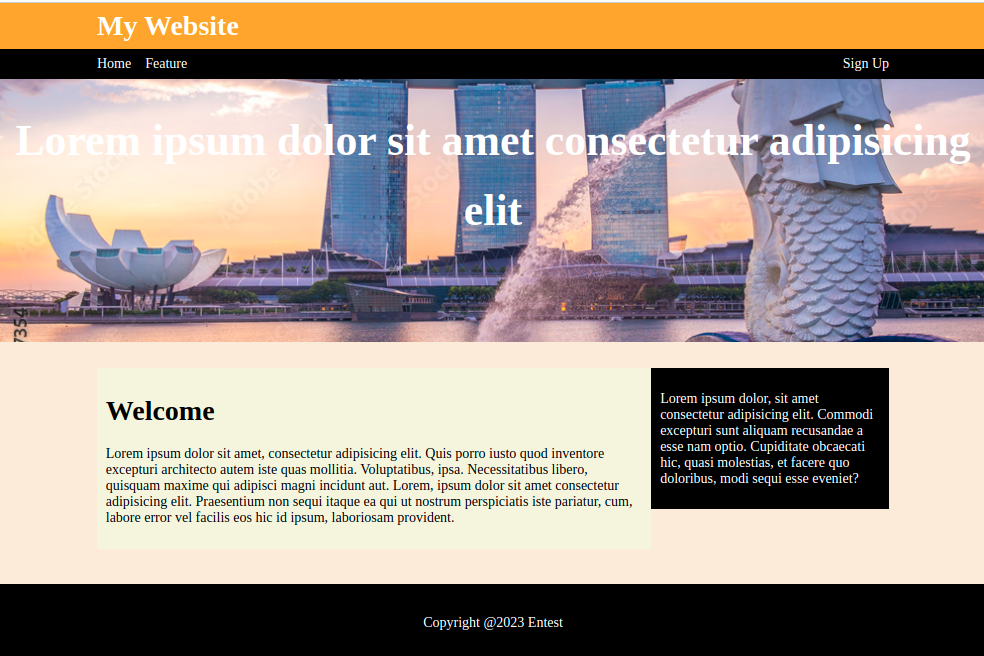
HTML#
<body><header><h1>My Website</h1></header><nav class="nav-site"><ul><li><a href="#">Home</a></li><li><a href="#">Feature</a></li><li class="nav-right"><a href="#"> Sign Up </a></li></ul></nav><div class="showcase"><h1>Lorem ipsum dolor sit amet consectetur adipisicing elit</h1></div><div class="container"><main class="main"><h1>Welcome</h1><p>Lorem ipsum dolor sit amet, consectetur adipisicing elit. Quis porroiusto quod inventore excepturi architecto autem iste quas mollitia.Voluptatibus, ipsa. Necessitatibus libero, quisquam maxime qui adipiscimagni incidunt aut. Lorem, ipsum dolor sit amet consectetur adipisicingelit. Praesentium non sequi itaque ea qui ut nostrum perspiciatis istepariatur, cum, labore error vel facilis eos hic id ipsum, laboriosamprovident.</p></main><aside class="sidebar"><p>Lorem ipsum dolor, sit amet consectetur adipisicing elit. Commodiexcepturi sunt aliquam recusandae a esse nam optio. Cupiditate obcaecatihic, quasi molestias, et facere quo doloribus, modi sequi esse eveniet?</p></aside><p style="clear: both;"></p></div><footer><p>Copyright @2023 Entest</p></footer></body>
Basic Page#
<body>s<header></header><nav></nav><div class="showcase"></div><div class="container"></div><footer></footer></body>
Header#
to align the h1 of header with the container
header {background-color: orange;padding: 0.5em 0em;}header > h1 {width: 80%;margin: auto;color: white;}
and the footer
footer {background-color: black;color: white;margin-top: 40px;text-align: center;padding: 20px;}
Navigation#
please align it with the container 80 percent screen width, push the last nav item to the most right by using margin-left auto
.nav-site {background-color: black;}.nav-site > ul {list-style: none;display: flex;margin: auto;width: 80%;padding: 0;}.nav-site > ul > li {text-decoration: none;padding: 0.5em 0em;}.nav-site > ul > li + li {margin-left: 1em;}.nav-site > ul > li > a {text-decoration: none;color: white;}.nav-site > ul > .nav-right {margin-left: auto;}
Content Container#
with 80 percent of the screen width then using float to create two columns
.container {width: 80%;margin: auto;/* background-color: beige; */}
create the first column (main)
.main {float: left;width: 70%;background-color: beige;padding: 10px;box-sizing: border-box;}
create the second column (aside)
.sidebar {float: left;width: 30%;background-color: black;color: white;padding: 10px;box-sizing: border-box;}
Background Image#
background image cover mode
.showcase {background-image: url('./singapore.jpg');background-repeat: no-repeat;background-size: cover;background-position: center right;min-height: 300px;text-align: center;margin-bottom: 30px;}
Responsive#
when the screen is less than 600px, main and aside content should be in a column, this can be done by media query
@media only screen and (max-width: 600px) {.main {width: 100%;float: none;}.sidebar {width: 100%;float: none;}}